
How can cognitive accessibility simplify workflows?
API deployment was hindered by a complex technical infrastructure with confusing processes and cumbersome documentation. Cognitive accessibility practices provided the design insights to improve usability for everyone.
*Note: anonymized images and content shared with permission of my immediate supervisor.
Product
API Deployment Wizard
Client
Fortune 50 retailer
Timeframe
2 months
My role
Lead UX Designer & Researcher
Research methods
Ethnography, prototyping, usability testing
Participants
20+
Tools
Teams, Figma
The opportunity
For many products and organizations, APIs are the way customers buy and use products, whether those products are books, groceries, clothes, or even data or insights. For example: a shopper on a mobile app searches for a product, and an API retrieves the search results that are displayed to the shopper.
Established processes and reusable assets allowed one organization to accelerate deployment time within an incredibly complex cloud, network, and security infrastructure. However, process and documentation was difficult to navigate, understand, and apply, and frequently outdated. Mistakes were frequent, frustration was high, and the time-to-market was slowing down.
Additionally, tech workers are more likely to be neurodivergent — even beyond 50%. Accessibility practices, particularly cognitive accessibility, could provide the design insights to simplify the experience for not just for engineers that need cognitive accessibility, but for everyone.
objective
Accelerate API deployment with an easy-to-use and easy-to-understand deployment wizard, designed with an accessibility-first approach.
business value
A streamlined and simplified wizard can accelerate API deployment and reduce mistakes, leading to a faster time-to-market, happier customers, and ultimately more revenue.
The work
A kickoff meeting with developers and the project / product lead established the problem statement, project goals, and timelines. I scoped several phases of research based on the timeline and project risks: initial research, design, testing, and refinement.
research questions
- What makes deploying an API so challenging?
- What workarounds to engineers use to deploy an API?
- What parts of the process are confusing?
- What accessibility challenges, particularly cognitive accessibility, were most prevalently impacting the deployment process and tools?
Interviews
For initial discovery, I conducted 4 semi-scripted interviews with engineers and engineering leads. The participants indicated that the labels and terms were confusing, redundant work required the engineers remember a lot of inputs and selection, and that the documentation was difficult to navigate and understand.
Additionally, participants indicated they would create their own reusable scripts and templates, and share them with other developers. This explained why some of the mistakes in APIs were so prevalent — engineer workarounds had essentially made the errors “go viral” within the organization.
Outlining accessibility requirements
WCAG 2.2 AA conformance was established as acceptance criteria. However, this project needed to rely on a design system with many non-conformant components and patterns.
A plan was established to document WCAG failures resulting from the design system components, and provide those to the design system team as product requests.
Even with the design system limitations, there were many elements of accessibility we could control, particularly cognitive accessibility. In addition to WCAG standards, W3C document Making Content Usable for People with Cognitive and Learning Disabilities provided user stories and design objectives to apply as requirements.
Workflow mapping
The primary step of the design phase was to map out the workflow, and particularly the inputs needed from engineers, such as repo names, workflow spaces, paths, project and team leads, business units, etc.
Once these inputs were identified, they were grouped into logical categories. Redundant fields were removed. Every field’s necessity was questioned, at times requiring discovery across systems and teams to find out if and how the input was used.
About 50% of the “necessary” inputs were able to be removed. The remaining were arranged into a logical, linear flow, with branching paths identified and mapped.
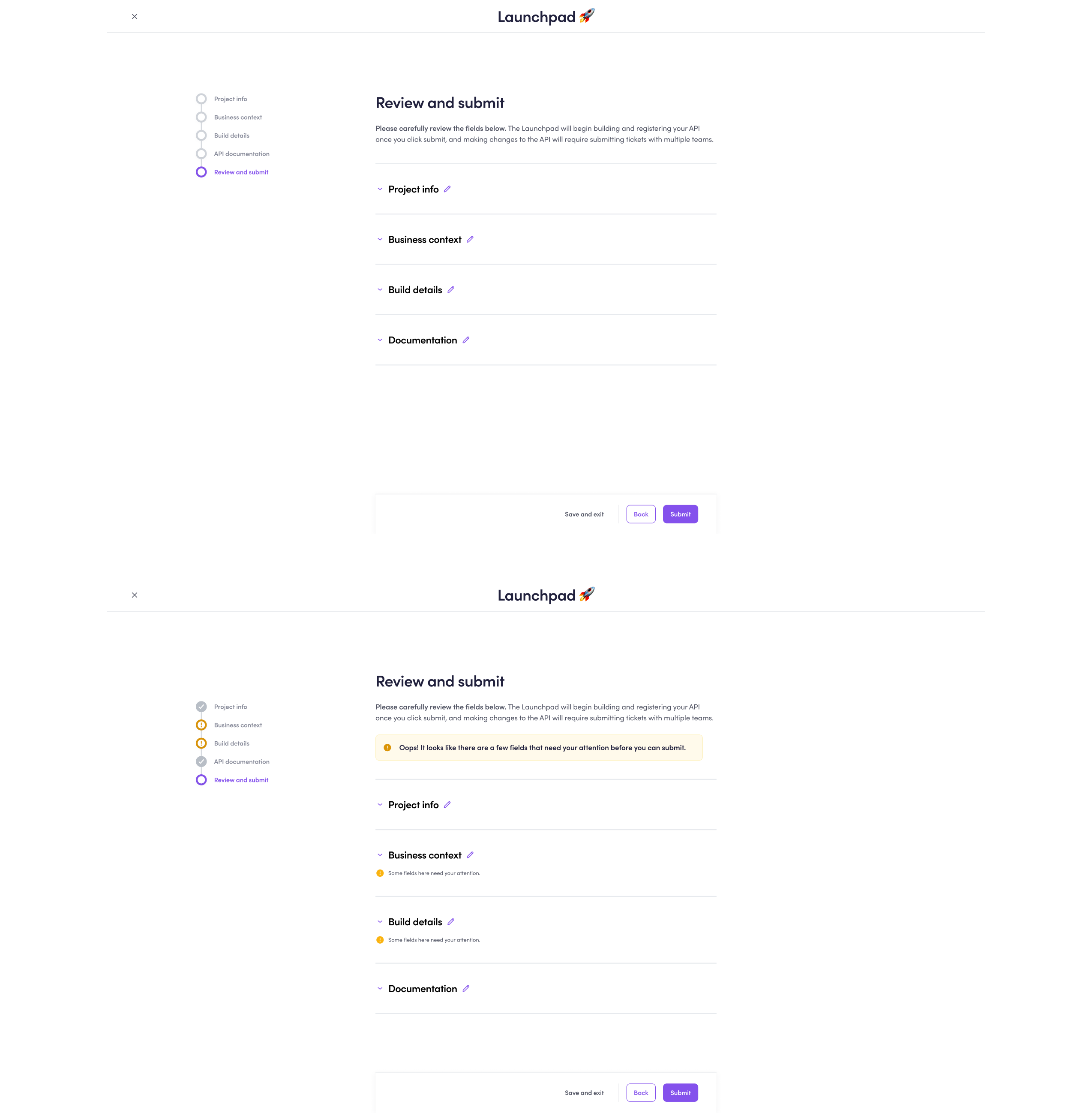
Initial design
The workflow was translated into a Figma prototype with accessibility annotations (using the CVS Figma annotation kit), with the design emphasizing the following goals:
Set expectations and be predictable
A clear introduction to the wizard helped engineers understand what the wizard would do and what they would need to complete the wizard. Additionally, the stepper component provided visibility into the wizard progress and remaining steps.
Focus attention
A content overlay component was used with a stepper workflow. Early design testing found that engineers found the interface simpler with the fields spread across 4 steps plus a final review step.
Simplify language
Business jargon in labels was replaced with terms more familiar to the engineers. Help tooltips provided a shorthand definition along with where the engineer may find the information. Additionally, a definitions page provided an searchable and sortable table with definitions, explanations for how inputs are used, and more details on how to find the information needed.
Reduce and guide choices
Where possible, fields were autopopulated based on user profiles. Where appropriate, fields were defaulted according to best practice options. Dropdown menus helped engineers understand fields by providing options.
Meaningfully group fields
Fields were grouped into steps that represented meaningful categories, such as information about the user, business context, technical details, and information for the end-user of the API. These groupings helped engineers understand the definition and purpose of the fields.
Be consistent
UI consistency from step to step made it easier for engineers to understand how to navigate the wizard and where to find help.
Make help easy
Bringing documentation directly into the workflow limited task switching and made it easier to complete the field.
Prevent lost work
Sometimes engineers may not have the information they needed. Autosave prevented them from needing to re-enter information and remember prior responses.
Assist with errors
Error detection and suggestions made it easy to correct issues. Additionally, the autopopulated and default fields helped reduce some of the most common errors uncovered during the initial discovery.
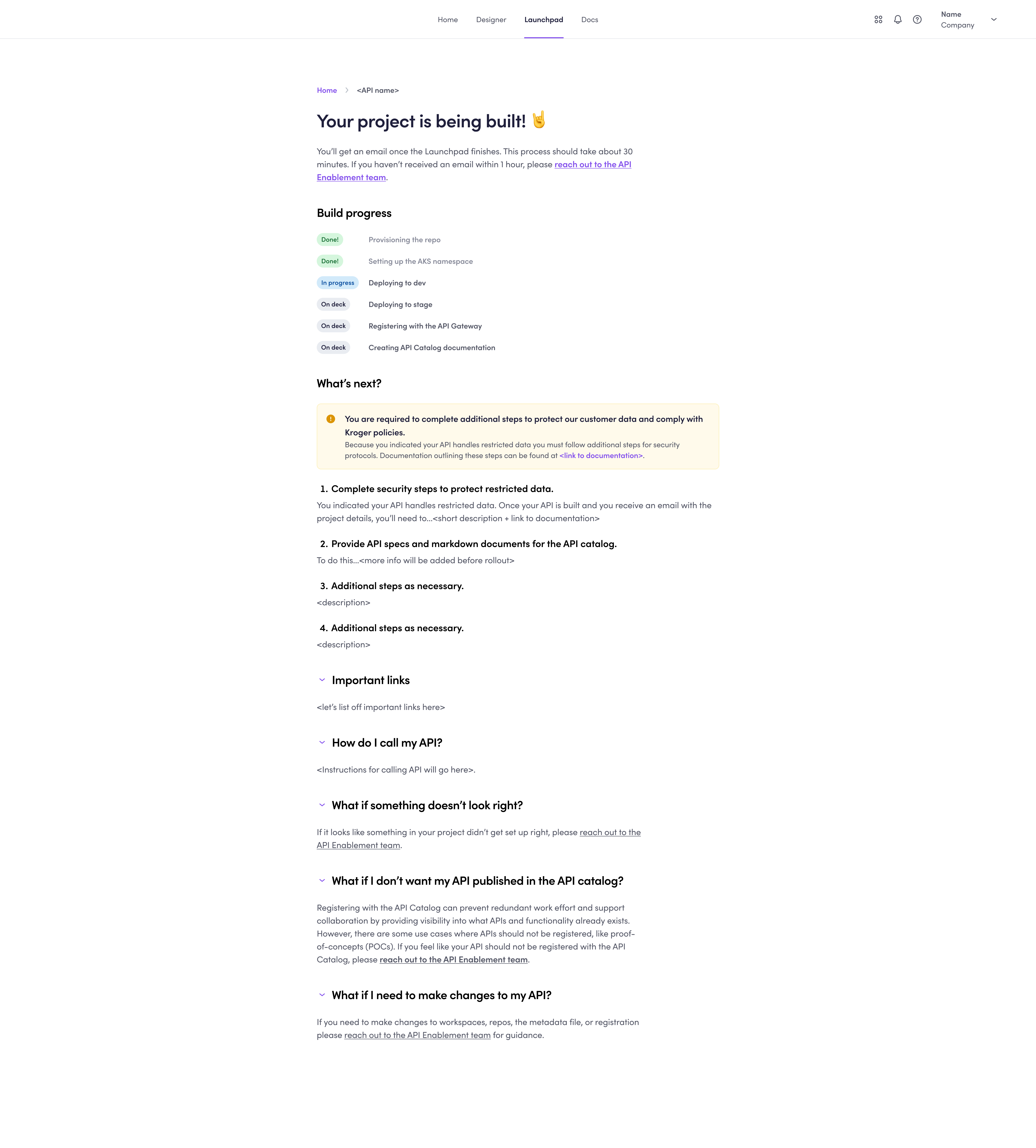
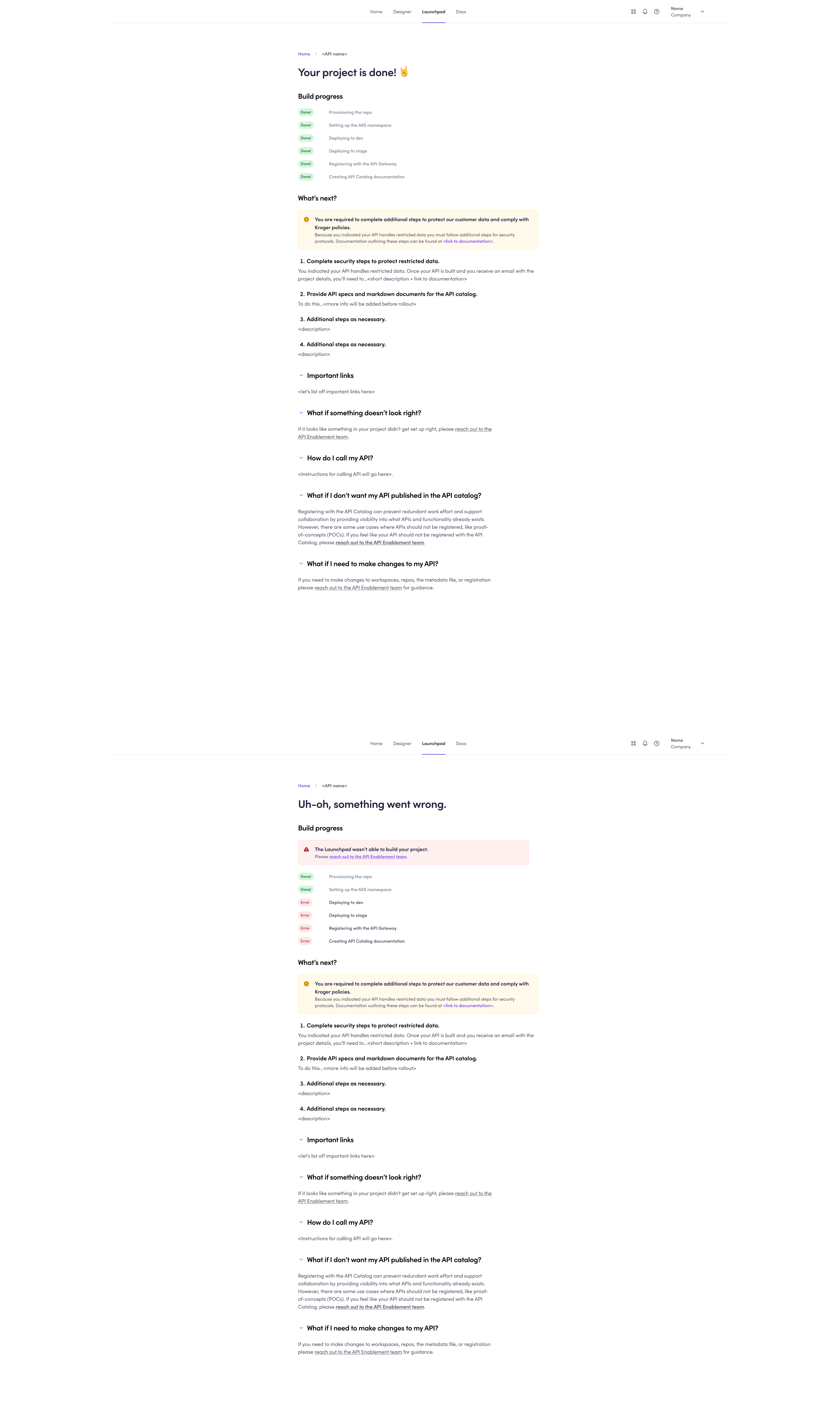
Clarify next steps
After completion of the wizard, engineers were clearly guided with next steps so predictability and usability continued even beyond the wizard interface.
Usability testing & refinements
Usability testing was both formative and summative. Formative usability testing identified minor enhancements to simplify language, and to improve predictability both before and after the wizard with a clear list of what was built by the wizard. Refinements were implemented into the design prior to launch.
Summative usability collected several key metrics: time-on-task, task success, the UX-Lite, and the Single Ease Questionnaire (S.E.Q.). In order to establish clear benchmarks, the wizard was compared to the existing process to deploy an API using a within-subjects design. Participants were asked to deploy an API using both the existing process and the new wizard (the ordering of the tasks was randomized). Confidence intervals were calculated for the metrics for each process as well as for the difference between the two.
See results below under outcomes.
Accessibility testing & remediation
Accessibility was tested against WCAG 2.2 AA standards manually and assisted with the WAVE and ARC Toolkit testers. A significant number of issues were identified with the design system components and patterns, and were catalogued and submitted to the design system team. The remaining issues were easily addressed within a one-hour pairing session with a developer (for example, empty buttons / links, adding labels to fields, proper heading and list structures, appropriate ARIA).
Final design


The outcomes
2x faster
vs. the existing process
66% improved usability
(UX-Lite)
“Excellent” –
“Best imaginable”
SUS rating
(projected from UX-Lite)
55% improved task difficulty
(Single Ease Questionnaire)
key design Decision 1
Remove as many fields as possible from the workflow.
Reason:
Many fields either weren’t actually used in the organization or could be automatically determined based on profiles and other inputs.
Impact:
Some of the inputs most strongly contributing to confusion were completely removed from the workflow, and the total number of fields were decreased by over 50%.
key design decision 2
Bring documentation into the workflow.
Reason:
Task switching was a huge challenge in this existing process, slowing down workflows and leading to mistakes.
Impact:
All participants were able to complete the workflow without having to leave the tool or stop the workflow.
key design decision 3
Replace existing input names with simpler labels that avoid business jargon.
Reason:
Engineers were unfamiliar with the business terms, which resulted in a lot of abandoned workflows, task switching to documentation, and guesses that led to mistakes and downstream business errors.
Impact:
Engineers found a lot of the fields far easier to understand when the labels were named from terms familiar to them, reducing workflow abandonment, task switching, and errors.
Reflections
This project was an exciting way to demonstrate the value of accessibility to an organization.
The end result may just seem like “good UX” — after all, who doesn’t benefit from simpler workflows?
But the approach, getting to the simpler workflows, was what differentiated this project. Cognitive accessibility was the critical practice that made API deployment so much easier for everyone (not to mention a population that likely over-indexes as neurodivergent).
Challenges
One of the biggest challenges was in determining which fields were actually necessary. Finding how the data was used, and where it went, was often a “wild goose chase”, requiring tracing social networks as each person told us that someone else might know the answer.
Also, knowing which accessibility issues we could control and which we couldn’t was a challenge given the design system limitations. It often took collaboration between myself, the wizard developers, and the design system team to identify what we could control and what we couldn’t.
If I could do it again…
While I did provide accessibility annotations, I didn’t do it for every screen because I was pairing so close with the developers building the wizard. However, when I got pulled onto other projects simultaneously and my time to pair became limited, we started seeing some mistakes. If I could do it again, I’d lean more into accessibility annotations even just for the practice of educating of others and demonstrating a status quo.