
How can a mobile app drive healthier behaviors and lower the cost of care?
Breaking into the value-based care market is no small feat. Established and experienced health systems are still struggling to drive health value and reduce the cost of care.
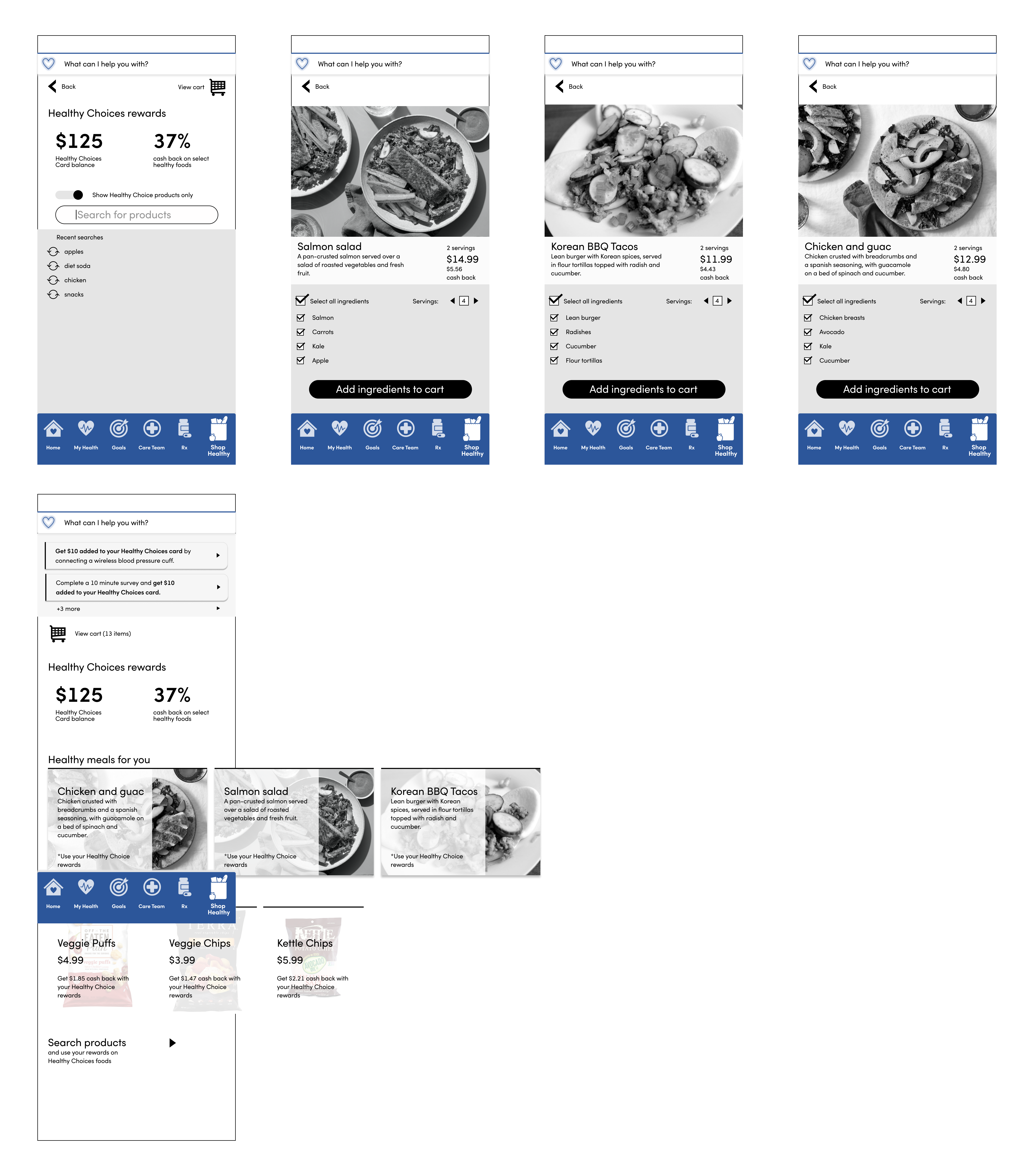
But if food is medicine, could the answer lie in small nudges and rewards to drive healthier food shopping behaviors?
*Note: anonymized images and content shared with permission of my immediate supervisor.
Product
Mobile app
Timeframe
2 weeks
My role
UX / Accessibility Designer, Healthcare SME
Research & design methods
Rapid ideation & prototyping
Participants
4
Tools
Teams, Figma
The opportunity
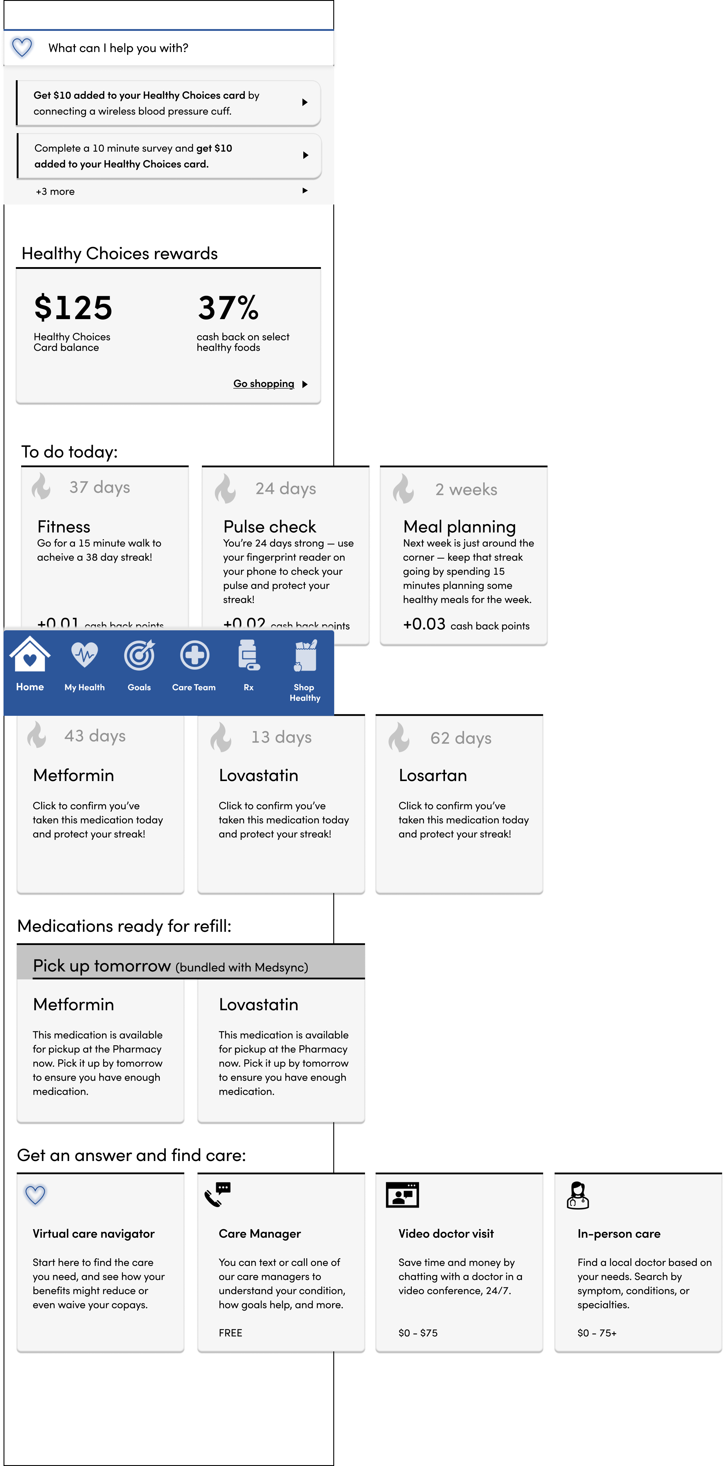
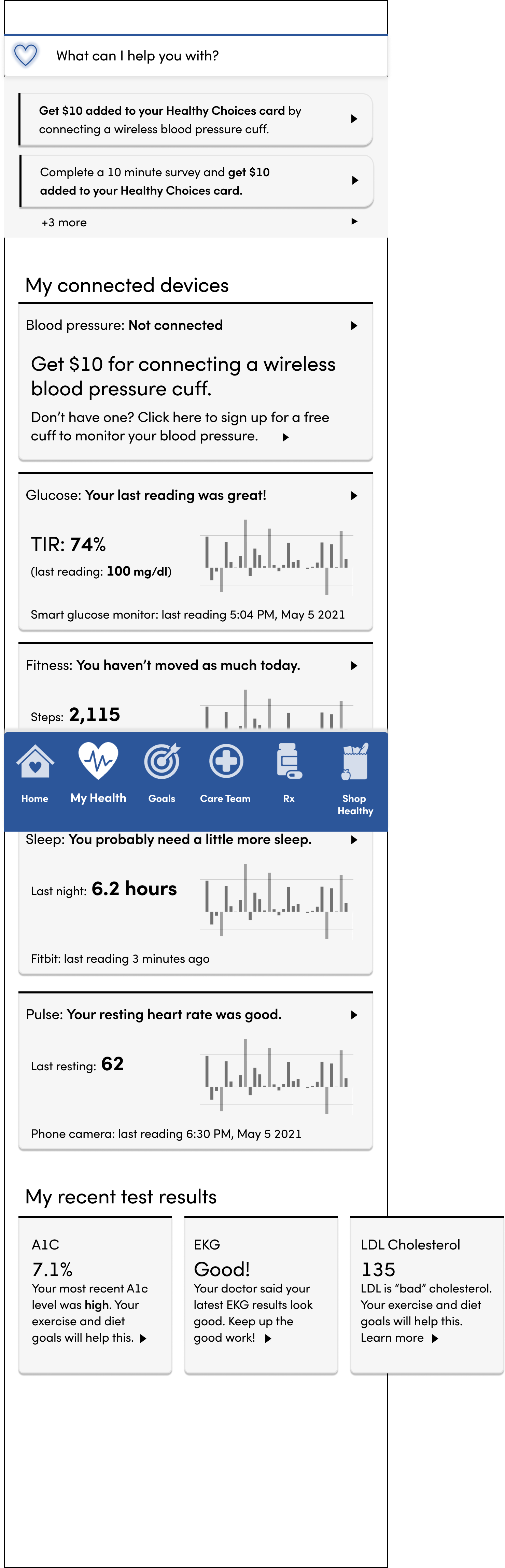
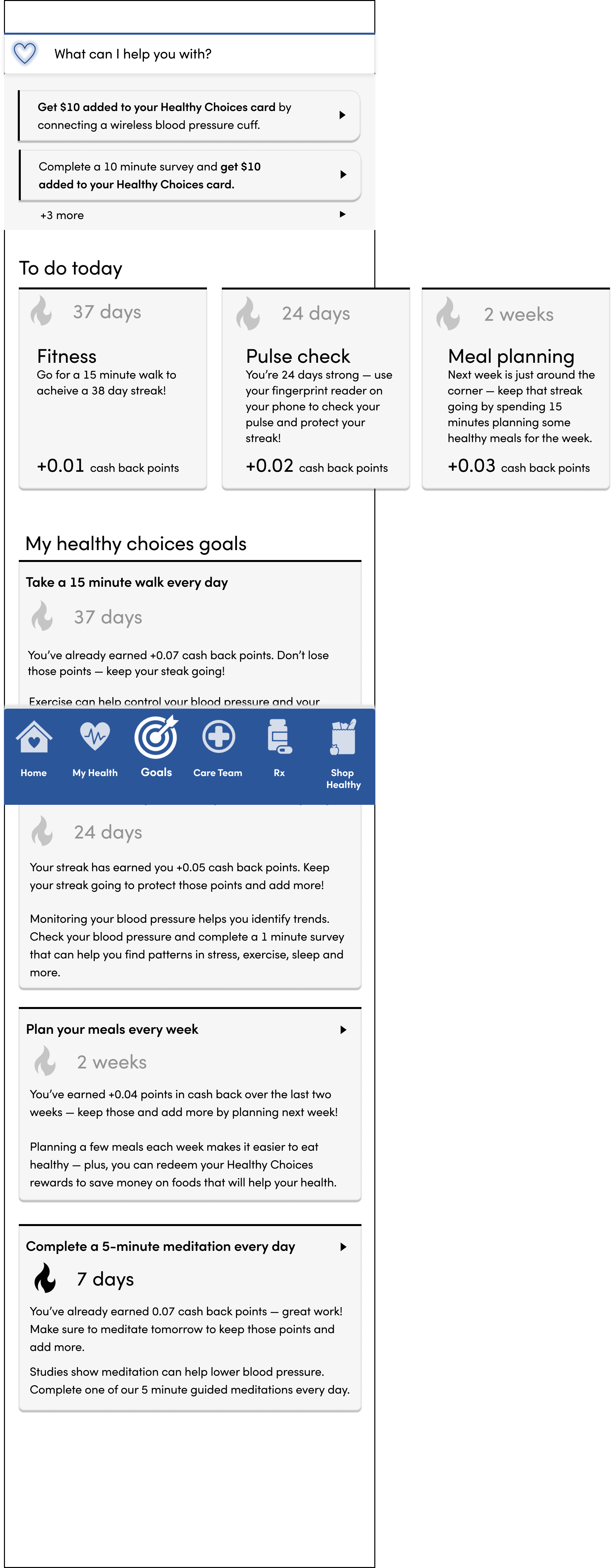
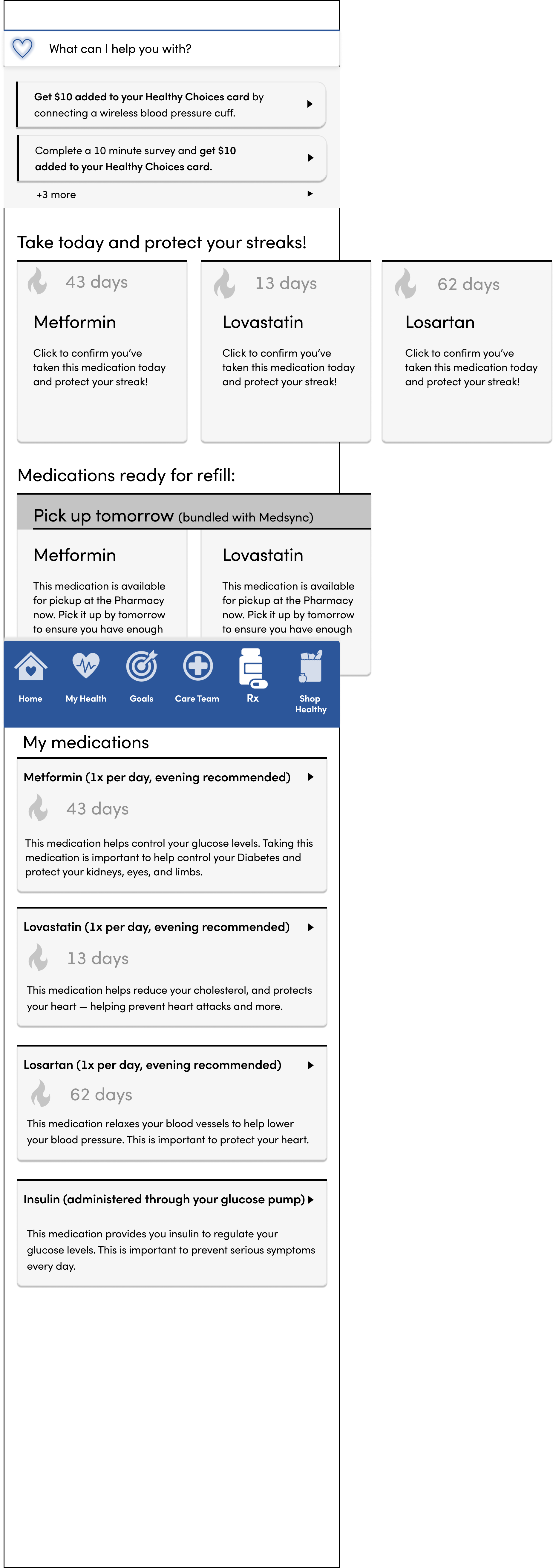
Over the last decade, social determinants of health and health behaviors have become a critical part of the value-based strategy. The idea is that identifying and addressing some of the non-medical challenges to patient health may be just as important — if not more — than medicine itself.
Diet and nutrition are critical parts of any health plan, and key to the management of many diseases targeted by value-based care plans (like diabetes and hypertension). But patients often struggle with meal planning, identifying healthier options, and affording healthier foods.
objective
Drive healthier behaviors, particularly those around diet and nutrition, to reach population-level quality metrics and reduce total cost of care.
business value
In value-based care, health systems and insurers receive financial rewards for reaching or exceeding standard quality targets as well as reducing the cost of care below certain targets.
The work
I scoped and planned the work with executives and strategists across multiple business domains and verticals.
research questions
- What are the most impactful health behaviors we want to encourage?
- What are the common barriers to those health behaviors?
- How can health behaviors be integrated with the digital shopping experience?
- What are the most prominent accessibility needs of the population?
desk research
My own background in value-based care healthcare and epidemiology provided a strong foundation to understand standard quality metrics for some of the most prevalent health conditions, as well as recommended healthy behaviors. Further research focused on systems to identify healthy foods as well as shopper behaviors for meal planning, shop preparation, and basket selection.
critical accessibility concerns
This mobile experience specifically targeted seniors and those with chronic health conditions, populations that are disproportionately likely to have disabilities.
As a vision-casting Figma prototype for a limited audience, many of the accessibility requirements would be reserved for a later, coded version of the app.
However, criteria and standards applying to visual visual and cognitive accessibility were relevant, including font size, contrast, target size, navigation, readability, consistency, and more.
**Note, in the screenshots below you’ll see low contrast for some of the goal Streak counts. This is a byproduct of the Figma prototype, the lived-coded version would provide outlines or other UI elements to distinguish waiting goals.
Feature prototyping
Alignment to the prototype vision was achieved by prototyping a first-time login experience as well as an in-app end-of-year review. The first-time login walks the patient through the benefits of using the mobile app, and the end-of-year review shows the patient the realized benefits, including improvements in health metrics, tallies of healthy behaviors, money saved on healthcare expenses, and total rewards earned for food shopping.
This prototype illustrated the use cases and user stories for stakeholder feedback and discussion, while also showcasing a general look and feel.
Prototyping the differentiators
Once the foundational features were established the work could turn toward the more exciting differentiators:
The outcomes
This prototype, built in just 2 weeks, generated executive excitement for long-term financial investment.
key design decision 1
The food shopping experience must be integrated into the healthcare app.
Reason:
A key feature of the experience is driving healthier food choices by making them a reward for other healthy behaviors.
Impact:
Integrated the healthcare and food shopping experiences created cognitive and behavioral connections to encourage healthier food choices.
key design decision 2
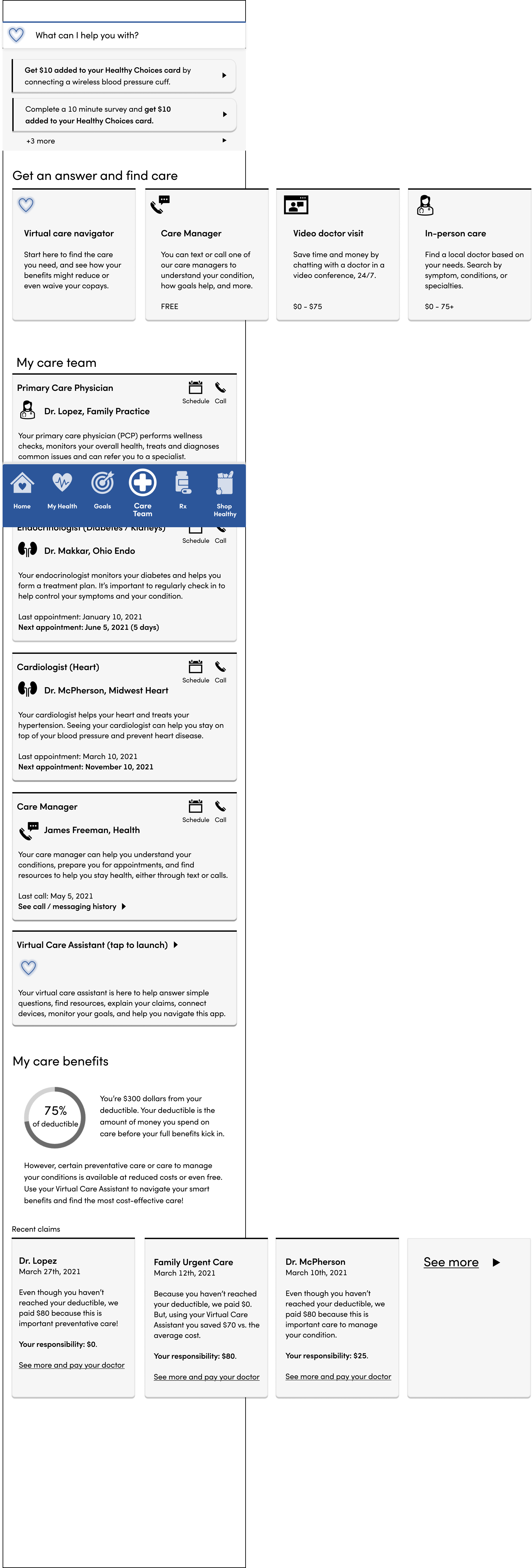
The mobile experience must support the fundamental elements of a successful value-based care plan, such as care management, medication adherence, and care navigation.
Reason:
Emphasize the benefits of the design system to the individual, rather than just the benefits to the business.
Impact:
Executives could easily trace the mobile experience features back to key population health strategies, providing a vision on how the app could drive success in a value-based market.
key design decision 3
The experience must simplify healthcare and medical complexity through built-in education with easy-to-understand language.
Reason:
Limited health literacy impacts patients’ ability to effectively and efficiently navigate the healthcare system and manage their chronic conditions.
Impact:
The prototype demonstrated the ways that a mobile experience can drive healthier behaviors through careful, empathic design.
Reflections
From kickoff to presentation, this project was a fast and furious 2 weeks — but guerrilla research and design got us to stakeholder excitement and ultimately, investment.
Challenges
Two weeks is fast, particularly when it’s not just UI design, not just UX design, but a total plan and program design.
My prior healthcare experience, as well as some of my lived experience, accelerated the concept phases.
And, creatively prototyping the beginning and ending experiences provided stakeholders with an opportunity to give feedback on the concept, rather than getting too bogged down in the details of an interface.
If I could do it again…
Honestly, I probably would have advocated to stay on with this client and project longer. I believe there was still a lot of value I could bring, and the project was fun and the team was great.