
How can we help users discover what they need?
A design system’s influence on products is only as good as its adoption, but adoption was limited because users didn’t know where components or guidelines were — and sometimes didn’t even know to look for them.
*Note: anonymized images and content shared with permission of my immediate supervisor.
Product
Design system
Timeframe
6 weeks
My role
UX researcher, IA designer
Methods
Content audit, card sorts, tree tests, co-design wireframing
Participants
28
Tools
UserZoom, R / R studio, Teams
The opportunity
Design systems are a powerful way to decrease costs and elevate the user experience at scale. Impossibly tedious efforts to update typography, colors, components, and patterns can become as simple as an upgrade (with an expected bug fix or two). The maintenance efforts of a single team can scale across all products, and UX enhancements can be pushed into products relatively immediately.
But all these benefits depend on adoption, which was stagnant. Initial conversations with users uncovered that users were often unaware components existed, and built their own. The documentation site was frequently accessed, but users didn’t find what they need…even when it existed. And sometimes, users would visit the documentation site to generate ideas — but the navigation discouraged the exploration that could lead to discovering the perfect component for the design.
objective
Design an information architecture to support all types of information seeking behaviors on the documentation site, including discovery.
business value
Stronger adoption scales the benefits of the design system: reduced development and maintenance costs, accelerated delivery, and an elevated user experience.
The work
I scoped and planned the work with the design system team, not only gathering requirements but also reviewing the roadmap to ensure that the information architecture considerations accommodated future expansion and growth.
research questions
- What mental models guide user understandings of design systems?
- What content groupings are natural to users?
- What labeling system might better fit user vocabulary and terminology?
- How might a navigation system better support information seeking, especially discovery?
content audit
I audited the existing documentation site, identifying well over 1,000 distinct content units. I then created categories of content units and established a logical taxonomy, with multidimensional facets to describe each category and content unit. For example, each component page included guidelines, dos and don’ts, sandbox examples, and code snippets. This provided several dimensions of understanding content, as some content was about the design system itself (components), while other content described the design system and provided instructions on how to use it (e.g., guidelines and sandbox examples).
At the end of the analysis, we had a Figjam board outlining and describing all 1,000 content units structured into a logical hierarchy.
Competitive analysis
I performed a competitive analysis of 50 other design systems by auditing their content and analyzing their labeling, navigation, and search systems.
This analysis uncovered common patterns, and the repetition across design systems may indicate the patterns are generally successful, or at least be familiar to designers experienced with other design systems. For example, many other systems visually and logically separate the guidelines (e.g. copywriting, error handling), the reusable assets (tokens, components, patterns, etc.), and information about the design system (getting started, contributing, getting help, etc.).
Comparing our own content to other design systems helped uncover missing content that our users might expect or might be of value. For example, most other design systems had information about accessibility, which our design system lacked at the time.
open card sorts
I developed an assortment of cards that were representative of a variety of types of content. I ended up with just under 40 cards, which is high for an open sort — but because we had a closer relationship with our small user base, we felt our users would be more willing to invest in our system by participating in the card sort. This hypothesis was supported by a 0% dropout rate.
We asked users to sort cards into groups, and then to name the categories. We limited the number of groups to 8, which was a frequent amount of distinct content units in other design systems.
While 11 users participated in unmoderated sessions, I moderated 6 sessions, 3 with each user role. I made sure to analyze the data separately to assess my own researcher bias, but differences in the data between unmoderated and moderated sessions were insubstantial. This allowed me to ask questions to explore users’ mental models and metaphors.
It also allowed for quality assurance. I actually designed one study, moderated two sessions, and uncovered some user confusion with the types of content selected. This allowed me to rebuild the test that allowed for more confident participation.
After the card sort I analyzed common groupings via cluster analysis and correlation matrices. Highly correlated groupings (r ≥ 0.7) were recommended, moderately correlated groupings ( 0.2 > r < 0.7) were evaluated for potential regroupings, and weak correlations (r ≤ 0.2) were recommended to be regrouped and addressed through multiple navigation pathways (e.g., “featured content” on the landing page).
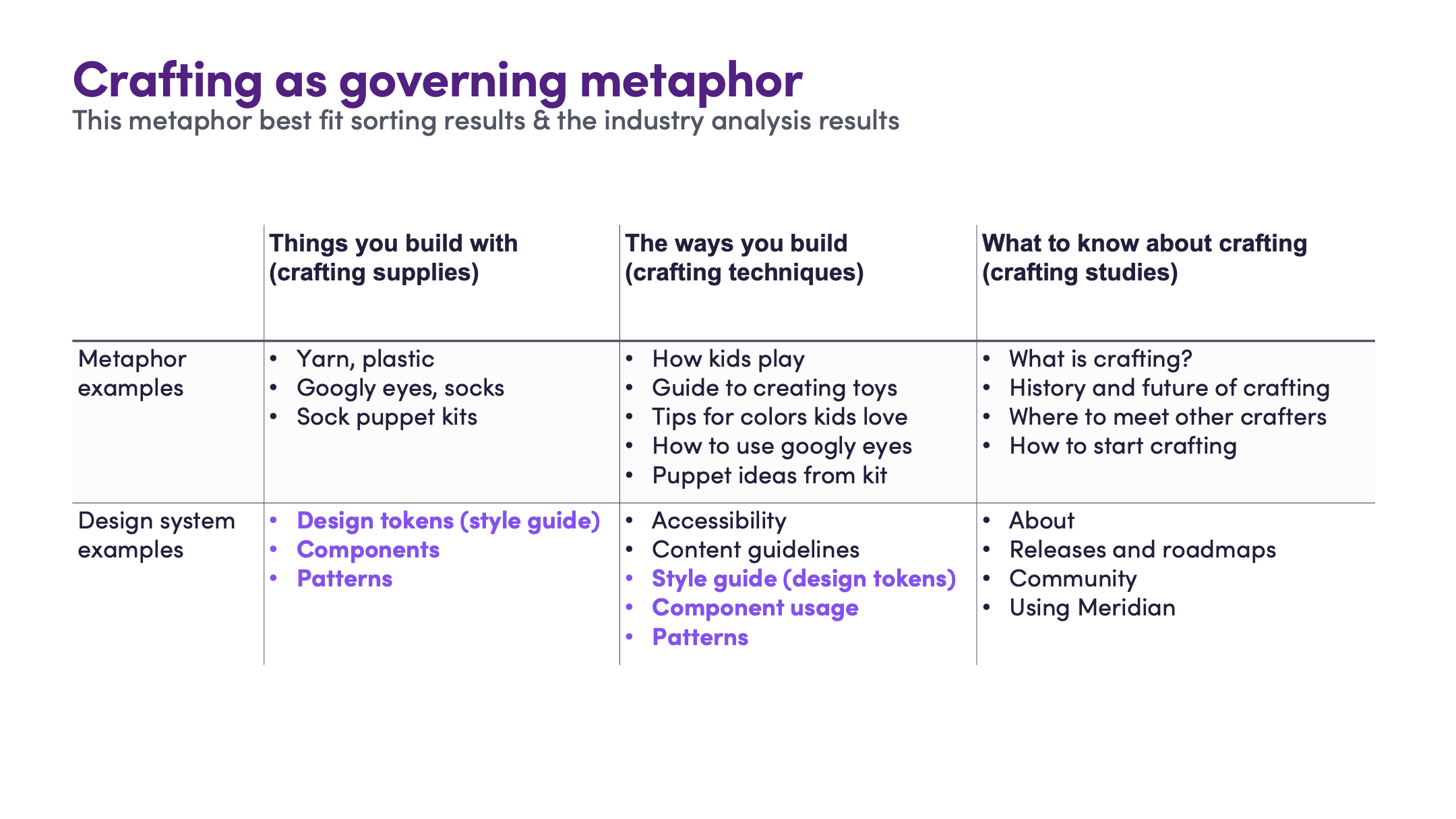
Group names and user comments were analyzed for metaphors, and one metaphor clearly emerged: crafting kits. Crafting kits were seen to have the supplies (string, beads, etc.) as well as instructions (e.g., how to tie a not), and examples or common patterns (e.g., a charm bracelet).
Labeling and navigation system design
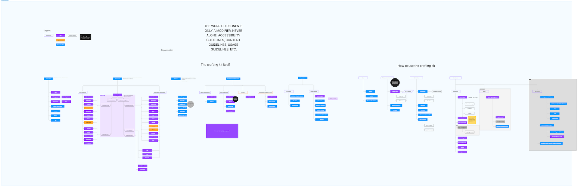
I put together an initial labeling and navigation system based on the card sort results, and then hosted an information architecture design workshop with the design system team. Using Figjam, we collaboratively aligned on a metaphor and organization system, and then proceeded to build a site map and navigation system.
Notably, we didn’t just design an information architecture that fit users’ mental models. Rather, we compared the card sort to the ways we wanted our users to see and view our products, and identified where we might need to go against user sorting to reshape their mental models.
tree tests
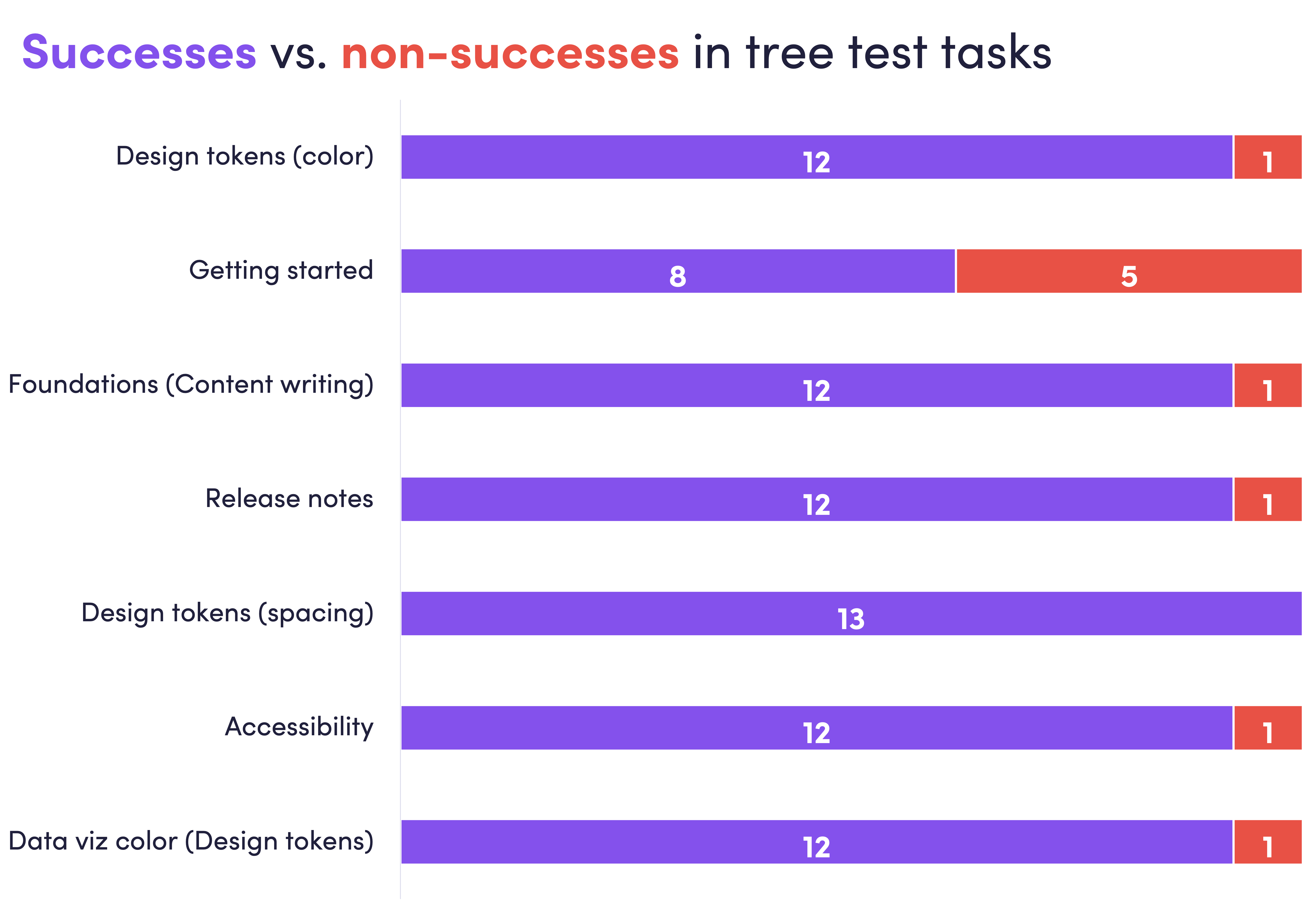
From the sitemap I created a navigation tree, and conducted a tree test with 14 participants (again moderating the first few sessions for observation and quality assurance). I asked users to find 5 different content units. Users performed strongly in all except one task, and qualitative data uncovered that the issue was the navigation but the label: the word was more common in engineering but unfamiliar to designers.
Because the design system team chose this label to align with the direction of the broader design industry and naming conventions in design products, and to support more collaboration between designers and developers, we decided to keep the label. Instead, the visual design and user interface would help users learn and remember a new term.
The navigation tree performed extremely well overall. One particular task performed poorly relative to the other tasks. Given this was the “getting started” page, this was addressed by adding home page content that provided more direct paths for new users.

co-design with design system team
After the tree test results readout, I hosted a co-design with the entire design system team. We iterated through several versions (even returning for a follow-up workshop a couple weeks later).
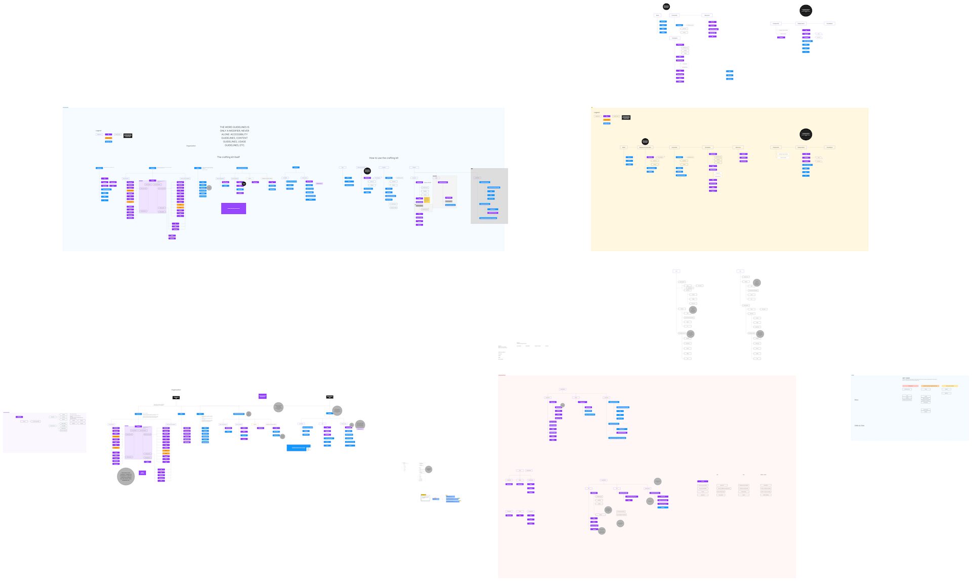
Final navigation system
The final system implemented the recommended dual navigation approach to solidify the crafting metaphor (crafting supplies vs. information about crafting). Additionally, future content was mapped into the system, as well as plans to deprecate content.
wireframing
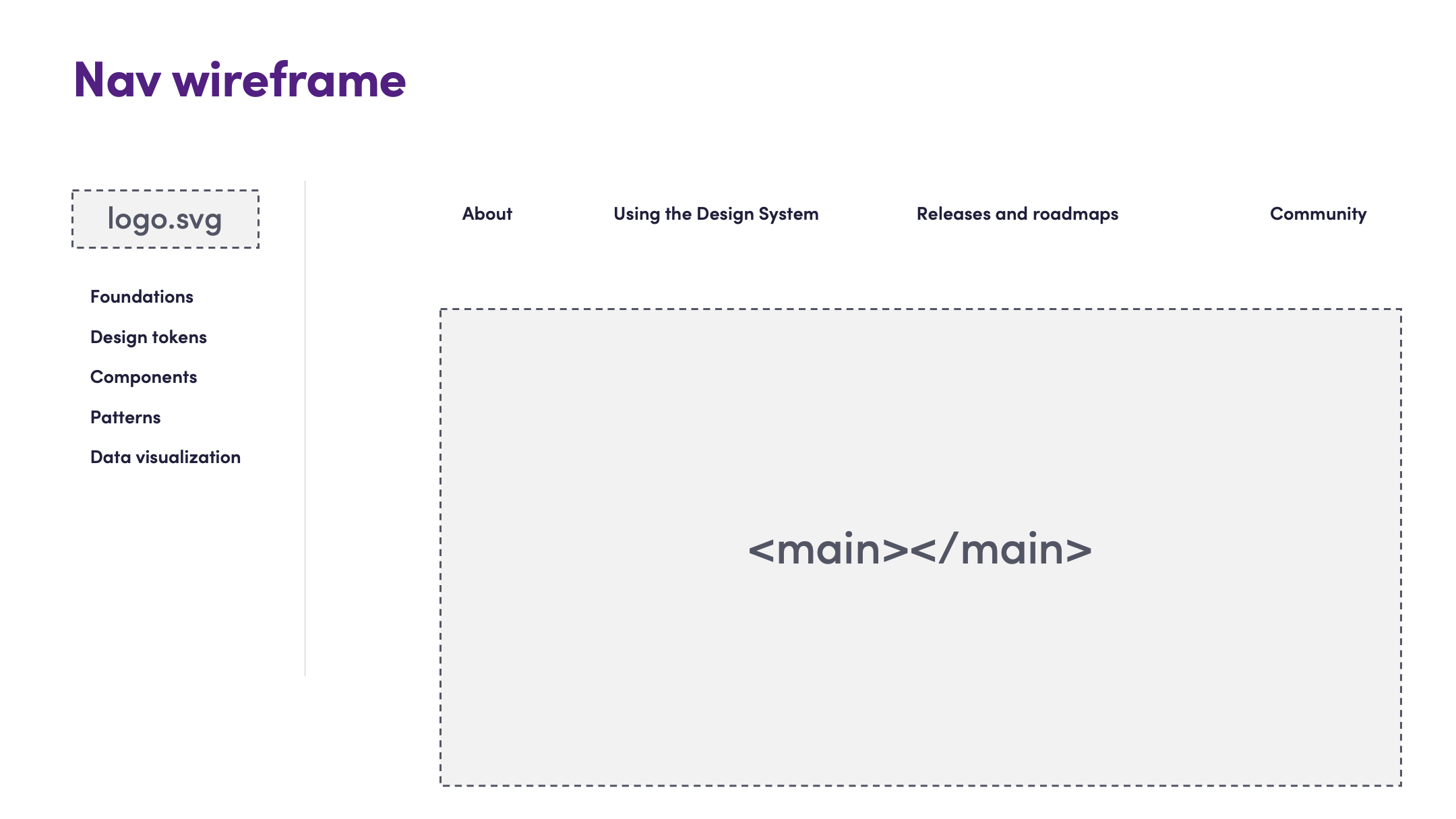
I created a variety of navigation and content wireframes that demonstrated how the visual layouts may support an information architecture and content hierarchy without needing explicit labels. In particular, I emphasized how landing pages, tables of contents, and featured content might address some of the shortcomings of the tree test. For example, using a top navigation bar and side navigation bar to distinguish different types of content (content about the system vs. components in the system), or having cards on the landing page that can educate users on how the information architecture fit together.
The outcomes
This research and design reshaped the documentation site, and established a roadmap for future content.
key design choice 1
Use the “crafting kit” metaphor as inspiration for the information architecture.
Reason:
Several users’ described design systems using the crafting kit metaphor, and the interpretation of the card sort results fit that metaphor.
Impact:
High-level content was organized into distinct categories based on the crafting kit metaphor: tokens, components, and patterns, etc. (crafting supplies), and instructions, tutorials, contribution guides, etc. (crafting instructions).
key design choice 2
Support a holistic mental model by adding content common to other design systems.
Reason:
Design systems with more robust content were able to rely on more holistic mental models.
Impact:
New content was added, providing new value and guidance to our users — particularly around accessibility and general usage guidelines.
key design choice 3
Create visual design elements that can guide users to understand new terms, particularly the more technical terms.
Reason:
Designers found terms more common to engineers to be challenging, but these new terms were important to align to industry standards and best practices. Using visual designs could help shape users’ mental models.
Impact:
The labels in the new information architecture are now common language among our design team, leading to a stronger understanding of how our entire design system connects to their work and tools.
Reflections
The fun of this project was its complexity. My other information architecture work has always been far simpler because there was less variety in the content, for example: collections of units in learning materials.
This meant the project presented intense challenge from beginning to end — making it a much more enjoyable growth experience.
Challenges
The variety of types of content made it extremely difficult to choose content for the card sort. The cards selected needed to capture the different dimensions of the content. I revised and sought feedback the card selection quite a few times before I felt it was ready for users to sort.
If I could do it again…
I think some co-design workshops with end users could have provided some powerful ways to collaborate and drive deeper engagement with the community.